Payoff Progress of an Amortizated Loan
15 years ago I took an education course for becoming a Certified Financial Planner from Northwestern University.Which is bullshit, NU rents its prestige to an independent training company. This was before the popularization of fee-only financial planners and I didn’t want to learn how to manage my finances from salespeople. I also had no interest in working as a CFP, so I didn’t take the exam and have never held this accreditation, but it does mean I often get tapped to explain things to friends who also don’t want to learn finance from salespeople.
A friend of mine is getting a mortgage for the first time. American mortgages are “amortized”, which is a suspicious concept.
In short, you pay the same amount every month but your payments are split between “principal” that pays back what you borrowed and “interest” that is the bank’s revenue. The split changes over time: your early payments are mostly interest, and over the life of the loan that split dwindles until your money goes entirely to principal.
This feels pretty weird, like maybe you’re getting ripped off at the beginning. Your money isn’t effectively paying off the loan right from the start? If you sell the house 10 years into a 30 year mortgage, shouldn’t you have a third of the equity? Now, there are reasons that amortization benefits both you and the bank, but I’m not going down that enticing rabbithole because I want to talk about something even more thrilling: charts.
If you try to read an intro to amortization you will see a lot of tedious tablesFinance jargon calls a table a "schedule" if it has dates in the future. and, in the nicer ones, a useless chart like this:
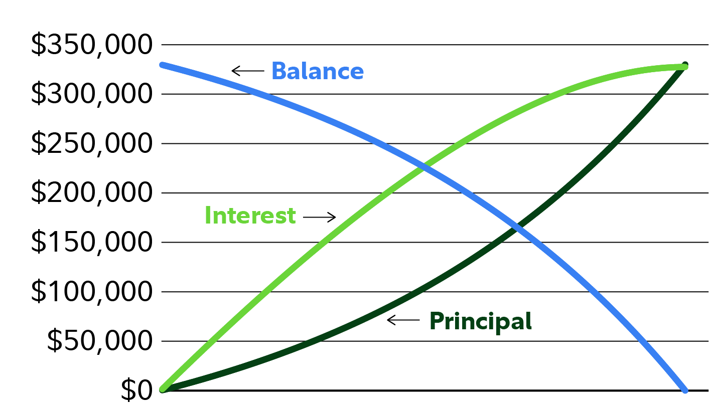
I appreciate an accurate but uninformative explanation as much as the next reader of man pages, but these charts are especially useless because they’re drawn from the bank’s perspective. The loan is their product, so they’re thinking about it top-down, the total values over the loan’s lifetime.The chart is also redundant. The balance is the inverse of the principal. Your eye is drawn to where the curves intersect, but those points don’t indicate anything meaningful. You think bottom-up, from the monthly payment that will become a very important feature in your life.
I was thinking about how to explain amortization better and I remembered how much I love fillable progress trackers and burndown charts. I once had a job at company with a typical four year equity grant: one year cliff, then quarterly vesting. About a year and a half in, I wanted a vivid reminder of each day’s value. On a little whiteboard I wrote how many days left until the next vest, and empty boxes for the each vesting.
![]()
Each morning I’d count down one more day, and once a quarter I filled in a box to mark one more grant. It helped.
I rolled these two topics around in my head and came up with a visual presentation to combine them. I sketched them out in Claude Code using Opus 4.8, and got this hybrid where the years run down the page and each box is sized to the principal you’re paying off that month.
The void between the principal payments and the right edge of the chart is the part of your payment that goes to interest. If you lay your head on your right shoulder you’ll see the boxes form the same shape as the “principal” line on the useless chart above.
It’s online if you’d like to play.
The number down the right column is the remaining principal to pay off; $300k in this example. I considered a running total of equity in this column, but it felt misleading when the final property value will be different than the original sale price. Percentage could work.
Interactive visualizations of how dynamic systems respond to varying input (“video games”) can be pretty instructive. This one sufficed for for talking through the parts that my friend was struggling with.
Continuing to tinker in CC, I threw on on some display options. Maybe the most useful is the ‘principal + interest’ mode that visualizes that your full payment with a reducing percent shaded to indicate the interest payments. (Though I’m not happy with how that forms vertical shapes which falsely imply each column of months has its own change over the years.)
The weakest pedagogy of this visualization is that it doesn’t really beat you over the head with how small changes to the interest rate have very large changes to the overall cost of the loan (that is, the total interest payments). You have to play with the interest rate a bit to get it. Maybe it’s worth showing the sum of the interest payments, or allow entering two interest rates.
Similarly, there’s a missed opportunity to teach the value of making additional principal payments. Entering one-off or recurring additional payments would move the right edge of the principal boxes to the right for that year and every following year.An inverse of the rocket equation, to give another vivid example. Maybe it would make visual sense to indent the left side of all future years to show the effect of prepayment.
If you’d like to tinker with these or other ideas, or use it in any way, knock yourself out. Between the CRS report and Thaler v. Perlmutter it seems that vibecoded software is in the public domain.